本文最后更新于:2023年8月24日 晚上
小标题案例(text-indent 文字缩进)
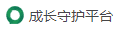
效果图:
知识点:
- text-indent 文字缩进
- background-position 背景图位置
思路:
- 图标当作div的背景,向左偏移
- 文字垂直居中,缩进显示图标
1
2
3
4
5
6
7
8
9
10
11
12
13
14
15
16
17
18
19
20
21
22
23
24
25
26
27
28
29
30
31
| <!DOCTYPE html>
<html lang="en">
<head>
<meta charset="UTF-8">
<title>Title</title>
<style>
* {
box-sizing: border-box;
margin: 0;
padding: 0;
}
.title {
text-indent: 30px;
background: url('https://game.gtimg.cn/images/js/title/title_sprite.png') no-repeat -30px center;
height: 40px;
line-height: 40px;
}
</style>
</head>
<body>
<div>
<div class="title">成长守护平台</div>
</div>
</body>
</html>
|
导航栏
知识点:
- 普通导航栏布局
- 复习伪类元素
1
2
3
4
5
6
7
8
9
10
11
12
13
14
15
16
17
18
19
20
21
22
23
24
25
26
27
28
29
30
31
32
33
34
35
36
37
38
39
40
41
42
| <!DOCTYPE html>
<html lang="en">
<head>
<meta charset="UTF-8">
<title>Title</title>
<style>
* {
margin: 0;
padding: 0;
}
a {
text-decoration: none;
color: #000;
padding: 0 20px;
display: inline-block;
margin-top: 1px;
}
a:hover {
background: #eee;
color: #F08A5D;
}
.nav {
border-top: 3px solid #F08A5D;
border-bottom: 1px solid #eee;
height: 50px;
line-height: 50px;
}
</style>
</head>
<body>
<div class="nav">
<a href="">设为首页</a>
<a href="">手机新浪网</a>
<a href="">移动客户端</a>
<a href="">博客</a>
<a href="">关注我</a>
</div>
</body>
</html>
|
a标签的默认高度就是父元素的行高
个人觉得太简单了,于是加了点动效:
1
2
3
4
5
6
7
8
9
10
11
12
13
14
15
16
17
18
19
20
21
22
23
24
25
26
27
| a {
text-decoration: none;
color: #000;
padding: 0 20px;
display: inline-block;
margin-top: 1px;
transition: .3s;
}
a:hover {
background: #eee;
color: #F08A5D;
}
a:after{
content: '';
height: 2px;
width: 0;
transition: .5s;
background: #F08A5D;
display: block;
margin: auto;
}
a:hover:after {
width: 100%;
}
|
小米侧边栏
知识点:
- 垂直导航栏布局
1
2
3
4
5
6
7
8
9
10
11
12
13
14
15
16
17
18
19
20
21
22
23
24
25
26
27
28
29
30
31
32
33
34
35
36
37
| <!DOCTYPE html>
<html lang="en">
<head>
<meta charset="UTF-8">
<title>Title</title>
<style>
.nav {
background: #7D7D7D;
width: 300px;
font: 15px/50px ''
}
a {
text-decoration: none;
color: #EEEEEE;
display: block;
padding-left: 35px;
}
a:hover {
background: #FF9234;
color: #fff;
}
</style>
</head>
<body>
<div class="nav">
<a href="">手机电话卡</a>
<a href="">电视 盒子</a>
<a href="">笔记本 平板</a>
<a href="">出行 穿搭</a>
<a href="">智能 路由器</a>
<a href="">健康 儿童</a>
<a href="">耳机 音响</a>
</div>
</body>
</html>
|
产品展示卡
- padding 百分比计算
- 文字单行省略
1
2
3
4
5
6
7
8
9
10
11
12
13
14
15
16
17
18
19
20
21
22
23
24
25
26
27
28
29
30
31
32
33
34
35
36
37
38
39
40
41
42
43
44
45
46
47
48
49
50
51
52
53
54
55
56
57
58
59
60
61
62
63
64
65
66
67
68
69
70
71
72
73
74
75
76
77
78
79
80
81
82
83
84
| <!DOCTYPE html>
<html lang="en">
<head>
<meta charset="UTF-8">
<title>Title</title>
<style>
* {
margin: 0;
padding: 0;
box-sizing: border-box;
}
.container {
width: 300px;
box-shadow: 0 0 5px 5px #ccc;
}
.container .img-box {
height: 0;
padding-bottom: 45%;
overflow: hidden;
}
.container .img-box img {
width: 100%;
cursor: pointer;
transition: .3s;
}
.container .img-box img:hover {
transform: scale(1.1);
}
.container .content {
padding: 30px 25px;
font: 15px/2 '';
}
.container .content .title {
margin-bottom: 40px;
}
.container .content .assess {
color: #C5C5C5;
font-size: 14px;
}
.container .content-footer * {
display: inline-block;
white-space: nowrap;
text-overflow: ellipsis;
overflow: hidden;
}
</style>
</head>
<body>
<div class="container">
<div class="img-box">
<img src="https://ossweb-img.qq.com/upload/webplat/info/yxzj/20181210/86638782789061.jpg"
alt="">
</div>
<div class="content">
<p class="title">快递牛,整体不错蓝牙可以说秒连,红米给力</p>
<p class="assess">来自于 XXXXX 的评价</p>
<div class="content-footer">
<p style="width: 70%">Redmi AirDots真无线蓝牙</p>
<span style="margin: 0 7px 0 5px;color: #ccc">|</span>
<p style="color: #F08A5D;font-weight: bold;max-width: 30%">99.9元</p>
</div>
</div>
</div>
</body>
</html>
|
快报
知识点:
- 行高继承
1
2
3
4
5
6
7
8
9
10
11
12
13
14
15
16
17
18
19
20
21
22
23
24
25
26
27
28
29
30
31
32
33
34
35
36
37
38
39
40
41
42
43
44
45
46
47
48
49
50
51
52
53
| <!DOCTYPE html>
<html lang="en">
<head>
<meta charset="UTF-8">
<title>Title</title>
<style>
* {
margin: 0;
padding: 0;
color: #393E46;
font: 15px/1.5 '';
}
a {
text-decoration: none;
}
li {
list-style: none;
height: 30px;
line-height: 30px;
}
.container {
border: 1px solid #ccc;
width: 300px
}
.title {
border-bottom: 1px solid #ccc;
height: 40px;
line-height: 40px;
padding-left: 20px;
}
.content {
padding: 10px 0 10px 15px;
}
</style>
</head>
<body>
<div class="container">
<h4 class="title">品优购快报</h4>
<ul class="content">
<li><a href="">【特惠】爆款耳机五折秒!</a></li>
<li><a href="">【特惠】母亲节,健康好礼低至五折!</a></li>
<li><a href="">【特惠】爆款耳机5折秒!</a></li>
<li><a href="">【特惠】9.9元洗100张照片!</a></li>
<li><a href="">【特惠】长虹智能空调立省1000</a></li>
</ul>
</div>
</body>
</html>
|
小米首页展示导航栏
知识点:
- 超链接配合无序列表做导航栏
- 外边距合并原理
- 盒子模型
1
2
3
4
5
6
7
8
9
10
11
12
13
14
15
16
17
18
19
20
21
22
23
24
25
26
27
28
29
30
31
32
33
34
35
36
37
38
39
40
41
42
43
44
45
46
47
48
49
50
51
52
53
54
55
56
57
58
59
60
61
62
63
64
| <!DOCTYPE html>
<html lang="en">
<head>
<meta charset="UTF-8">
<title>Title</title>
<style>
* {
margin: 0;
padding: 0;
box-sizing: border-box;
}
.header {
height: 400px;
}
.nav {
background: #393E46;
width: 250px;
font: 15px/50px '';
padding: 20px 0;
float: left;
height: 100%;
}
a {
text-decoration: none;
color: #EEEEEE;
display: block;
padding-left: 35px;
}
a:hover {
background: #FF9234;
color: #fff;
}
.plan {
float: left;
height: 100%;
}
.plan img {
object-fit: cover;
height: 100%;
}
</style>
</head>
<body>
<div class="header">
<div class="nav">
<a href="">手机 电话卡</a>
<a href="">电视 盒子</a>
<a href="">笔记本 平板</a>
<a href="">出行 穿搭</a>
<a href="">智能 路由器</a>
<a href="">健康 儿童</a>
<a href="">耳机 音响</a>
</div>
<div class="plan">
<img src="https://res.youpin.mi-img.com/youpinoper/79acf6d5_b744_4988_ada9_5dde11aaebdf.jpeg" alt="">
</div>
</div>
</body>
</html>
|
学成在线
知识点:
- 取名
- 浮动布局
- 链接标签 ul > li > a
index.html
1
2
3
4
5
6
7
8
9
10
11
12
13
14
15
16
17
18
19
20
21
22
23
24
25
26
27
28
29
30
31
32
33
34
35
36
37
38
39
40
41
42
43
44
45
46
47
48
49
50
51
52
53
54
55
56
57
58
59
60
61
62
63
64
65
66
67
68
69
70
71
72
73
74
75
76
77
78
79
80
81
82
83
84
85
86
87
88
89
90
91
92
93
94
95
96
97
98
99
100
101
102
103
104
105
106
107
108
109
110
111
112
113
114
115
116
117
118
119
120
121
122
123
124
125
126
127
128
129
130
131
132
133
134
135
136
137
138
139
140
141
142
143
144
145
146
147
148
149
150
151
152
153
154
155
156
157
158
159
160
161
162
163
164
165
166
167
168
169
170
171
172
173
174
175
176
177
178
179
180
181
182
183
184
185
186
187
188
189
190
191
192
193
194
195
196
197
198
199
200
201
202
203
204
205
206
207
208
209
210
211
212
213
214
215
216
217
218
219
220
221
222
223
224
225
226
227
228
229
230
231
232
233
234
235
236
237
238
239
240
241
242
243
244
245
246
247
248
249
250
251
252
253
254
255
256
257
258
259
260
261
262
263
264
265
266
267
268
269
270
271
272
273
274
275
276
277
278
279
| <!DOCTYPE html>
<html lang="en">
<head>
<meta charset="UTF-8">
<title>Title</title>
<link rel="stylesheet" href="./index.css">
</head>
<body>
<div class="header base-box">
<div class="logo">
<img src="./img/logo.png" alt="">
</div>
<div class="nav">
<ul>
<li><a href="">首页</a></li>
<li><a href="">课程</a></li>
<li><a href="">职业规划</a></li>
</ul>
</div>
<div class="search">
<input type="text" placeholder="请输入关键字"/>
<button></button>
</div>
<div class="user">
<img src="./img/user.png" alt="">
FSAN
</div>
</div>
<div class="banner">
<div class="base-box">
<div class="sub-nav">
<ul>
<li><a href="">前端开发</a></li>
<li><a href="">后端开发</a></li>
<li><a href="">移动开发</a></li>
<li><a href="">人工智能</a></li>
<li><a href="">商业预测</a></li>
<li><a href="">云计算&大数据</a></li>
<li><a href="">运维&从测试</a></li>
<li><a href="">UI设计</a></li>
<li><a href="">产品</a></li>
</ul>
</div>
<div class="course">
<h2>我的课程表</h2>
<div class="bd">
<ul>
<li>
<h4>继续学习 程序语言设计</h4>
<p>正在学习,使用对象</p>
</li>
<li>
<h4>继续学习 程序语言设计</h4>
<p>正在学习,使用对象</p>
</li>
<li>
<h4>继续学习 程序语言设计</h4>
<p>正在学习,使用对象</p>
</li>
</ul>
<a href="" class="more">全部课程</a>
</div>
</div>
</div>
</div>
<div class="goods base-box">
<ul>
<li><a href="" class="active">精品推荐</a></li>
<li><a href="">JQuery</a></li>
<li><a href="">Spark</a></li>
<li><a href="">MySQL</a></li>
<li><a href="">JavaWeb</a></li>
<li><a href="">MySQL</a></li>
<li><a href="" class="end">JavaWeb</a></li>
</ul>
<span>修改兴趣</span>
</div>
<div class="module1 base-box">
<div class="title">
<h3>精品推荐</h3>
<span>查看更多</span>
</div>
<div class="content">
<ul>
<li>
<a href="">
<div class="content-img">
<img src="./img/course01.png" alt="">
</div>
<h4 class="content-bd">Think PHP 5.0 博客系统实战项目演练</h4>
<div class="info">
<span class="color-text">高级</span>
<span>·</span>
1125人在学习
</div>
</a>
</li>
<li>
<a href="">
<div class="content-img">
<img src="./img/course01.png" alt="">
</div>
<h4 class="content-bd">Think PHP 5.0 博客系统实战项目演练</h4>
<div class="info">
<span class="color-text">高级</span>
<span>·</span>
1125人在学习
</div>
</a>
</li>
<li>
<a href="">
<div class="content-img">
<img src="./img/course01.png" alt="">
</div>
<h4 class="content-bd">Think PHP 5.0 博客系统实战项目演练</h4>
<div class="info">
<span class="color-text">高级</span>
<span>·</span>
1125人在学习
</div>
</a>
</li>
<li>
<a href="">
<div class="content-img">
<img src="./img/course01.png" alt="">
</div>
<h4 class="content-bd">Think PHP 5.0 博客系统实战项目演练</h4>
<div class="info">
<span class="color-text">高级</span>
<span>·</span>
1125人在学习
</div>
</a>
</li>
<li>
<a href="">
<div class="content-img">
<img src="./img/course01.png" alt="">
</div>
<h4 class="content-bd">Think PHP 5.0 博客系统实战项目演练</h4>
<div class="info">
<span class="color-text">高级</span>
<span>·</span>
1125人在学习
</div>
</a>
</li>
<li>
<a href="">
<div class="content-img">
<img src="./img/course01.png" alt="">
</div>
<h4 class="content-bd">Think PHP 5.0 博客系统实战项目演练</h4>
<div class="info">
<span class="color-text">高级</span>
<span>·</span>
1125人在学习
</div>
</a>
</li>
<li>
<a href="">
<div class="content-img">
<img src="./img/course01.png" alt="">
</div>
<h4 class="content-bd">Think PHP 5.0 博客系统实战项目演练</h4>
<div class="info">
<span class="color-text">高级</span>
<span>·</span>
1125人在学习
</div>
</a>
</li>
<li>
<a href="">
<div class="content-img">
<img src="./img/course01.png" alt="">
</div>
<h4 class="content-bd">Think PHP 5.0 博客系统实战项目演练</h4>
<div class="info">
<span class="color-text">高级</span>
<span>·</span>
1125人在学习
</div>
</a>
</li>
<li>
<a href="">
<div class="content-img">
<img src="./img/course01.png" alt="">
</div>
<h4 class="content-bd">Think PHP 5.0 博客系统实战项目演练</h4>
<div class="info">
<span class="color-text">高级</span>
<span>·</span>
1125人在学习
</div>
</a>
</li>
<li>
<a href="">
<div class="content-img">
<img src="./img/course01.png" alt="">
</div>
<h4 class="content-bd">Think PHP 5.0 博客系统实战项目演练</h4>
<div class="info">
<span class="color-text">高级</span>
<span>·</span>
1125人在学习
</div>
</a>
</li>
</ul>
</div>
</div>
<div class="footer">
<div class="base-box">
<div class="left">
<img src="./img/logo.png" alt="">
<p>
学成在线致力于普及中国最好的教育它与中国一流大学和机构合作提供在线课程。
<br/>
© 2017年XTCG Inc.保留所有权利。-沪ICP备15025210号</p>
<button>下载APP</button>
</div>
<div class="right">
<dl>
<dt>关于学成网</dt>
<dd><a href="">关于</a></dd>
<dd><a href="">管理团队</a></dd>
<dd><a href="">工作机会</a></dd>
<dd><a href="">客户服务</a></dd>
<dd><a href="">帮助</a></dd>
</dl>
<dl>
<dt>关于学成网</dt>
<dd><a href="">关于</a></dd>
<dd><a href="">管理团队</a></dd>
<dd><a href="">工作机会</a></dd>
<dd><a href="">客户服务</a></dd>
<dd><a href="">帮助</a></dd>
</dl>
<dl>
<dt>关于学成网</dt>
<dd><a href="">关于</a></dd>
<dd><a href="">管理团队</a></dd>
<dd><a href="">工作机会</a></dd>
<dd><a href="">客户服务</a></dd>
<dd><a href="">帮助</a></dd>
</dl>
</div>
</div>
</div>
</body>
</html>
|
index.css
1
2
3
4
5
6
7
8
9
10
11
12
13
14
15
16
17
18
19
20
21
22
23
24
25
26
27
28
29
30
31
32
33
34
35
36
37
38
39
40
41
42
43
44
45
46
47
48
49
50
51
52
53
54
55
56
57
58
59
60
61
62
63
64
65
66
67
68
69
70
71
72
73
74
75
76
77
78
79
80
81
82
83
84
85
86
87
88
89
90
91
92
93
94
95
96
97
98
99
100
101
102
103
104
105
106
107
108
109
110
111
112
113
114
115
116
117
118
119
120
121
122
123
124
125
126
127
128
129
130
131
132
133
134
135
136
137
138
139
140
141
142
143
144
145
146
147
148
149
150
151
152
153
154
155
156
157
158
159
160
161
162
163
164
165
166
167
168
169
170
171
172
173
174
175
176
177
178
179
180
181
182
183
184
185
186
187
188
189
190
191
192
193
194
195
196
197
198
199
200
201
202
203
204
205
206
207
208
209
210
211
212
213
214
215
216
217
218
219
220
221
222
223
224
225
226
227
228
229
230
231
232
233
234
235
236
237
238
239
240
241
242
243
244
245
246
247
248
249
250
251
252
253
254
255
256
257
258
259
260
261
262
263
264
265
266
267
268
269
270
271
272
273
274
275
276
277
278
279
280
281
282
283
284
285
286
287
288
289
290
291
292
293
294
295
296
297
298
299
300
301
302
303
304
305
306
307
308
309
310
311
312
313
314
315
316
317
318
319
320
321
322
323
324
325
326
327
328
329
330
331
332
333
334
335
336
337
338
339
340
341
342
343
344
345
346
347
348
349
350
351
352
353
354
355
356
357
358
359
360
361
362
363
364
365
366
367
368
369
370
371
372
373
374
375
376
377
378
379
380
381
382
383
384
385
386
387
388
389
390
391
392
| * {
padding: 0;
margin: 0;
}
li {
list-style: none;
}
body {
background-color: #f3f5f7;
}
a {
text-decoration: none;
color: #000;
}
.base-box {
width: 1200px;
margin: 0 auto;
}
.base-box::after {
content: '';
display: block;
height: 0;
clear: both;
visibility: hidden;
}
.header {
margin: 30px auto 29px;
height: 42px;
}
.header .logo {
float: left;
width: 195px;
height: 42px;
}
.header .nav {
float: left;
height: 42px;
margin-left: 70px;
}
.header .nav ul li {
display: inline-block;
margin-right: 25px;
}
.header .nav ul li a {
display: block;
height: 42px;
line-height: 42px;
font-size: 18px;
color: #050505;
padding: 0 10px;
}
.header .nav ul li a:hover {
border-bottom: 2px solid #00a4ff;
color: #00a4ff;
}
.header .search {
float: left;
margin-left: 70px;
height: 42px;
width: 412px;
}
.header .search input {
float: left;
border: 1px solid #00a4ff;
border-right: none;
color: #bfbfbf;
font-size: 14px;
text-indent: 15px;
width: 360px;
height: 40px;
outline: none;
}
.header .search button {
float: left;
height: 42px;
width: 50px;
border: none;
background: url("./img/btn.png");
}
.header .user {
float: right;
line-height: 42px;
margin-right: 30px;
font-size: 14px;
color: #666;
}
.header .user img {
vertical-align: middle;
margin-right: 10px;
}
.banner {
height: 421px;
background: #1b026b;
}
.banner .base-box {
position: relative;
height: 100%;
background: url("./img/big-banner.png") no-repeat top center;
}
.banner .base-box .sub-nav {
height: 100%;
width: 190px;
background: rgba(0, 0, 0, .3);
}
.banner .base-box .sub-nav li {
height: 45px;
line-height: 45px;
padding: 0 20px;
}
.banner .base-box .sub-nav li a {
color: #fff;
font-size: 14px;
display: inline-block;
width: 100%;
position: relative;
}
.banner .base-box .sub-nav li a:after {
content: '>';
color: #fff;
position: absolute;
right: 0;
}
.banner .base-box .sub-nav li a:hover, .banner .base-box .sub-nav li a:hover:after {
color: #00a4ff;
}
.banner .base-box .course {
position: absolute;
right: 0;
top: 50%;
transform: translate(0, -50%);
width: 230px;
height: 300px;
background: #fff;
}
.banner .base-box .course h2 {
height: 48px;
background-color: #9bceea;
font: 18px/ 48px '';
text-align: center;
font-weight: bold;
color: #fff;
letter-spacing: 2px;
}
.banner .base-box .course .bd {
padding: 0 20px;
}
.banner .base-box .course .bd li {
padding: 15px 0;
border-bottom: 1px solid #ccc;
cursor: pointer;
}
.banner .base-box .course .bd li:hover > h4 {
color: #00a4ff;
}
.banner .base-box .course .bd h4 {
font-size: 16px;
color: #4e4e4e;
font-weight: normal;
}
.banner .base-box .course .bd p {
font-size: 12px;
color: #a5a5a5;
}
.banner .base-box .course .bd .more {
display: block;
height: 38px;
line-height: 38px;
text-align: center;
border: 1px solid #00a4ff;
color: #00a4ff;
font-weight: bold;
font-size: 16px;
margin-top: 5px;
}
.goods {
margin-top: 8px;
box-shadow: 0 0 5px 2px #ccc;
height: 60px;
line-height: 60px;
font-size: 16px;
}
.goods ul {
float: left;
}
.goods li {
display: inline-block;
}
.goods li a {
position: relative;
padding: 0 35px;
}
.goods li a:hover {
color: #00a4ff;
}
.goods li a:after {
content: '|';
line-height: normal;
display: inline-block;
position: absolute;
right: 0;
top: 0;
color: #ccc;
}
.goods li .end:after {
content: '';
}
.goods li .active {
font-size: 18px;
font-weight: bold;
color: #00a4ff;
}
.goods span {
float: right;
margin-right: 30px;
color: #00a4ff;
font-size: 14px;
font-weight: 400;
}
.module1 {
margin-top: 30px;
}
.module1 .title {
height: 42px;
}
.module1 .title h3 {
float: left;
font-weight: normal;
font-size: 20px;
color: #494949;
}
.module1 .title span {
float: right;
font-size: 12px;
color: #a5a5a5;
margin: 10px 30px 0;
}
.module1 .content {
width: 1234px;
margin-bottom: 10px;
}
.module1 .content li {
display: inline-block;
margin: 0 15px 15px 0;
background: #fff;
}
.module1 .content a {
display: block;
width: 228px;
height: 270px;
}
.module1 .content a .content-img {
height: 0;
padding-bottom: 155px;
}
.module1 .content a .content-img img {
width: 100%;
object-fit: cover;
}
.module1 .content a .content-bd {
margin: 20px 20px 20px 24px;
font-size: 14px;
color: #050505;
font-weight: 400;
}
.module1 .content a .info {
margin: 0 20px 0 25px;
font-size: 12px;
color: #999;
}
.module1 .content a .info .color-text {
color: #ff7c2d;
}
.module1 .content a .info .color-text + span {
margin: 0 7px;
}
.footer {
height: 400px;
background: #fff;
}
.footer .base-box {
padding-top: 25px;
}
.footer .base-box .left {
float: left;
}
.footer .base-box .left p {
color: #666;
font-size: 12px;
margin: 15px 0;
}
.footer .base-box .left button {
border: 2px solid #00a4ff;
font-size: 16px;
padding: 10px 30px;
background: #fff;
color: #00a4ff;
}
.footer .base-box .right {
float: right;
color: #666;
}
.footer .base-box dl {
float: left;
margin-right: 100px;
}
.footer .base-box dt {
font-size: 16px;
margin-bottom: 10px;
}
.footer .base-box dd {
font-size: 12px;
line-height: 25px;
}
.footer .base-box dd a {
color: #666;
}
|
精灵图拼接姓名
知识点:
- 背景图的position属性裁剪精灵图
1
2
3
4
5
6
7
8
9
10
11
12
13
14
15
16
17
18
19
20
21
22
23
24
25
26
27
28
29
30
31
32
33
34
35
36
37
38
39
| <!DOCTYPE html>
<html lang="en">
<head>
<meta charset="UTF-8">
<title>Title</title>
<style>
span {
display: inline-block;
width: 106px;
height: 112px
}
.q {
background: url('./abcd.jpg') no-repeat -8px -414px;
}
.i {
background: url('./abcd.jpg') no-repeat -323px -136px;
width: 65px;
}
.x {
background: url('./abcd.jpg') no-repeat -251px -554px;
}
.n {
background: url('./abcd.jpg') no-repeat -257px -275px;
width: 110px;
}
</style>
</head>
<body>
<span class="q"></span>
<span class="i"></span>
<span class="x"></span>
<span class="i"></span>
<span class="n"></span>
</body>
</html>
|
热点图动画
知识点:
- 子绝父绝的使用
- 阴影配合动画显示
- animation-delay 延迟效果
1
2
3
4
5
6
7
8
9
10
11
12
13
14
15
16
17
18
19
20
21
22
23
24
25
26
27
28
29
30
31
32
33
34
35
36
37
38
39
40
41
42
43
44
45
46
47
48
49
50
51
52
53
54
55
56
57
58
59
60
61
62
63
64
65
66
67
68
69
70
71
72
73
74
75
76
77
78
79
80
81
82
83
84
85
86
87
88
89
90
91
92
93
94
95
96
| <!DOCTYPE html>
<html lang="en">
<head>
<meta charset="UTF-8">
<title>Title</title>
<style>
* {
margin: 0;
padding: 0;
box-sizing: border-box;
}
.map {
position: relative;
margin: 0 auto;
width: 600px;
height: 600px;
}
.city {
position: absolute;
right: 150px;
top: 100px;
}
.city > div {
width: 8px;
height: 8px;
border-radius: 50%;
}
.city .dotted {
background: #00a4ff;
}
.city .dotted::after {
content: '北京';
position: absolute;
left: 20px;
top: 50%;
transform: translateY(-50%);
display: block;
width: 40px;
}
.city [class^=pulse] {
position: absolute;
left: 50%;
top: 50%;
transform: translate(-50%, -50%);
box-shadow: 0 0 12px #009dfd;
animation: pulse .9s linear infinite;
}
.city .pulse1 {
animation-delay: .4s;
}
.city .pulse2 {
animation-delay: .8s;
}
.city .pulse3 {
animation-delay: 1.2s;
}
@keyframes pulse {
from {
}
70% {
width: 40px;
height: 40px;
opacity: 1;
}
to {
width: 70px;
height: 70px;
opacity: 0;
}
}
</style>
</head>
<body>
<div class="map">
<div class="city">
<div class="dotted"></div>
<div class="pulse1"></div>
<div class="pulse2"></div>
<div class="pulse3"></div>
</div>
</div>
</body>
</html>
|
这里变宽要直接设置宽度,使用transform会导致阴影也变大
进度条效果
知识点:
transition 匀速变化- 控制伪元素属性
1
2
3
4
5
6
7
8
9
10
11
12
13
14
15
16
17
18
19
20
21
22
23
24
25
26
27
28
29
30
31
32
33
34
35
36
37
38
39
40
41
42
43
44
45
46
47
48
| <!DOCTYPE html>
<html lang="en">
<head>
<meta charset="UTF-8">
<title>Title</title>
<style>
* {
margin: 0;
padding: 0;
box-sizing: border-box;
}
div {
position: relative;
margin: 200px auto;
width: 200px;
height: 10px;
border: 1px solid darkred;
border-radius: 5px;
}
div::after {
content: '';
display: block;
position: absolute;
transition: width 3s linear .2s;
height: 8px;
width: 0;
background: darkred;
border-radius: 5px;
}
h2 {
cursor: pointer;
text-align: center;
}
h2:hover + div::after {
width: 100%;
}
</style>
</head>
<body>
<h2>鼠标放这加载进度条</h2>
<div></div>
</body>
</html>
|
打字机效果
知识点:
- 文字强制一行显示
- 超出隐藏
- 动画属性的 steps()
1
2
3
4
5
6
7
8
9
10
11
12
13
14
15
16
17
18
19
20
21
22
23
24
25
26
27
28
29
30
31
32
33
34
35
36
37
38
| <!DOCTYPE html>
<html lang="en">
<head>
<meta charset="UTF-8">
<title>Title</title>
<style>
body {
background: #7D7D7D;
}
h1 {
white-space: nowrap;
overflow: hidden;
animation: width-open 7s steps(36) forwards;
color: #fff;
width: 0;
}
@keyframes width-open {
from {
}
to {
width: calc(32px * 36);
}
}
</style>
</head>
<body>
<div>
<h1>无论我去往哪里,那都是我该去的地方,经历我该经历的事,遇见我该遇见的人。</h1>
</div>
</body>
</html>
|
奔跑的熊
知识点:
- 使用动画将长图片做出gif图的效果
- 动画属性多写
- 背景图水平平铺做出无限运动
1
2
3
4
5
6
7
8
9
10
11
12
13
14
15
16
17
18
19
20
21
22
23
24
25
26
27
28
29
30
31
32
33
34
35
36
37
38
39
40
41
42
43
44
45
46
47
48
49
50
51
52
53
54
55
56
57
58
59
60
61
62
63
64
65
66
67
68
69
70
71
72
73
74
75
76
77
78
79
| <!DOCTYPE html>
<html lang="en">
<head>
<meta charset="UTF-8">
<title>Title</title>
<style>
body {
background: #7D7D7D;
}
* {
margin: 0;
padding: 0;
}
.bear-bg {
position: relative;
height: 600px;
}
div[class^=bg-] {
position: absolute;
width: 100%;
height: 100%;
}
.bg-1 {
background: url("img/bg1.png") repeat-x left bottom;
bottom: 0;
z-index: -1;
animation: bg-move 10s linear infinite;
}
.bg-2 {
background: url("img/bg2.png") repeat-x left bottom;
bottom: 20px;
z-index: -2;
animation: bg-move 20s linear infinite;
}
.bear {
position: absolute;
left: 0;
bottom: 0;
width: 200px;
height: 100px;
background: url("img/bear.png") no-repeat left;
animation: bear-run .7s steps(8) infinite, bear-move 3.5s ease-out forwards;
}
@keyframes bear-run {
100% {
background-position-x: -1600px;
}
}
@keyframes bear-move {
100% {
left: 50%;
transform: translateX(-50%);
}
}
@keyframes bg-move {
100% {
background-position-x: -3840px;
}
}
</style>
</head>
<body>
<div class="bear-bg">
<div class="bear"></div>
<div class="bg-1"></div>
<div class="bg-2"></div>
</div>
</body>
</html>
|
难点:
- 背景在x上平铺达到循环效果
- 对于熊的关键帧提取,动画属性可以直接写两个动画
穿梭的盒子
使用3D呈现做出穿梭盒子的效果
知识点:
- 视距使用
transform-style: preserve-3d; 为子元素开启三维立体环境- 对于3d盒子的旋转
1
2
3
4
5
6
7
8
9
10
11
12
13
14
15
16
17
18
19
20
21
22
23
24
25
26
27
28
29
30
31
32
33
34
35
36
37
38
39
40
41
42
43
44
45
46
47
| <!DOCTYPE html>
<html lang="en">
<head>
<meta charset="UTF-8">
<title>Title</title>
<style>
body {
perspective: 500px;
}
.box {
position: relative;
width: 200px;
height: 200px;
margin: 100px auto;
transform-style: preserve-3d;
transition: 2s;
}
.box:hover {
transform: rotateY(60deg);
}
.box > div {
position: absolute;
top: 0;
left: 0;
width: 100%;
height: 100%;
background-color: pink;
}
.box :last-child {
background-color: #00a4ff;
transform: rotateX(60deg);
}
</style>
</head>
<body>
<div class="box">
<div></div>
<div></div>
</div>
</body>
</html>
|
两面翻转盒子
效果:鼠标放置div,div翻转后显示另一行文字
知识点:
- 三维空间想象(一个盒子前一个盒子后,后的那个要正常显示需要Y轴翻转180)
backface-visibility: hidden;盒子背后不可见,可见的话就会遮住该显示的部分transform-style: preserve-3d; 的使用
1
2
3
4
5
6
7
8
9
10
11
12
13
14
15
16
17
18
19
20
21
22
23
24
25
26
27
28
29
30
31
32
33
34
35
36
37
38
39
40
41
42
43
44
45
46
47
48
49
50
51
52
53
54
55
56
57
58
59
60
61
62
| <!DOCTYPE html>
<html lang="en">
<head>
<meta charset="UTF-8">
<title>Title</title>
<style>
.box {
perspective: 400px;
width: 300px;
height: 300px;
line-height: 300px;
margin: 100px auto;
}
.box:hover .container {
transform: rotateY(180deg);
}
.container {
position: relative;
transition: 2s;
transform-style: preserve-3d;
}
.container > h1 {
position: absolute;
left: 0;
top: 0;
margin: 0;
border-radius: 50%;
width: 100%;
color: #fff;
text-align: center;
cursor: help;
backface-visibility: hidden;
}
.container :first-child {
background-color: #00a4ff;
}
.container :last-child {
background-color: #ff7c2d;
transform: rotateY(180deg);
}
</style>
</head>
<body>
<div class="box">
<div class="container">
<h1>经历该经历的事</h1>
<h1>遇见该遇见的人</h1>
</div>
</div>
</body>
</html>
|
3D导航栏
效果:鼠标放置后,盒子类似长方体向上翻转,显示底部文字
知识点:
- 注意长方体翻转时,轴心一定是长方体的中心点,所以要将正面向Z轴偏移出去
- 底部的旋转要注意文字的位置
总结:遇到这种立方体旋转的,就需要注意中心点位置
1
2
3
4
5
6
7
8
9
10
11
12
13
14
15
16
17
18
19
20
21
22
23
24
25
26
27
28
29
30
31
32
33
34
35
36
37
38
39
40
41
42
43
44
45
46
47
48
49
50
51
52
53
54
55
56
57
58
59
60
61
62
63
64
65
66
67
68
69
70
71
72
73
74
75
76
77
78
79
80
81
| <!DOCTYPE html>
<html lang="en">
<head>
<meta charset="UTF-8">
<title>Title</title>
<style>
* {
margin: 0;
padding: 0;
}
body {
perspective: 500px;
}
ul {
margin: 50px auto;
text-align: center;
}
li {
list-style: none;
display: inline-block;
}
.box {
position: relative;
transform-style: preserve-3d;
transition: .4s;
width: 100px;
height: 40px;
text-align: center;
line-height: 40px;
}
.box:hover {
transform: rotateX(90deg);
}
.box > div {
position: absolute;
width: 100%;
transition: 1s;
}
.box :first-child {
background-color: #00a4ff;
transform: translateZ(20px);
}
.box :last-child {
background-color: #ff7c2d;
transform: translateY(20px) rotateX(-90deg);
}
</style>
</head>
<body>
<ul>
<li>
<div class="box">
<div>首页</div>
<div>这里没有人</div>
</div>
</li>
<li>
<div class="box">
<div>首页</div>
<div>这里没有人</div>
</div>
</li>
<li>
<div class="box">
<div>首页</div>
<div>这里没有人</div>
</div>
</li>
</ul>
</body>
</html>
|
旋转木马效果
知识点:
- 图片正方向就是Z轴正方向,所以先旋转后偏移就可以做成这个效果
- 给大盒子背景图片达到中心一张图片旋转的效果
- 视距可以大一点,因为图片本身就蛮大的
1
2
3
4
5
6
7
8
9
10
11
12
13
14
15
16
17
18
19
20
21
22
23
24
25
26
27
28
29
30
31
32
33
34
35
36
37
38
39
40
41
42
43
44
45
46
47
48
49
50
51
52
53
54
55
56
57
58
59
60
61
62
63
64
65
| <!DOCTYPE html>
<html lang="en">
<head>
<meta charset="UTF-8">
<title>Title</title>
<style>
body {
perspective: 1000px;
}
section {
position: relative;
transform-style: preserve-3d;
animation: dog-run 15s linear infinite;
background: url("pig.jpg") no-repeat center;
width: 300px;
height: 200px;
margin: 200px auto;
}
@keyframes dog-run {
100% {
transform: rotateY(360deg);
}
}
section > div {
position: absolute;
background: url("dog.jpg") no-repeat center;
width: 100%;
height: 100%;
}
section div:nth-child(1) {
transform: translateZ(400px);
}
section div:nth-child(2) {
transform: rotateY(72deg) translateZ(400px);
}
section div:nth-child(3) {
transform: rotateY(144deg) translateZ(400px);
}
section div:nth-child(4) {
transform: rotateY(216deg) translateZ(400px);
}
section div:nth-child(5) {
transform: rotateY(288deg) translateZ(400px);
}
</style>
</head>
<body>
<section>
<div></div>
<div></div>
<div></div>
<div></div>
<div></div>
</section>
</body>
</html>
|
京东首页流式布局
知识点:
- 使用初始化css(normalize.css)时注意link引入顺序
- 移动端meta标签
- 别忘了图片的基线对齐
- 三栏水平布局(左右两块宽度不动,中间自适应)思路:
- 左右两边用定位
- 中间一个标准流,加左右外边距留出距离
代码就不贴了,对元素定位时多使用百分比即可
苏宁首页(rem + 媒体查询 + less)【方案一】
知识点:
- 先使用媒体查询定义公共的css,对页面的宽度设置对应的字体大小(一般页面水平分15份)
- 然后根据设计图的宽度计算设计图中rem的大小
份数大小 = 页面宽度 / 份数(设计图上的宽度 / 15),如设计图宽度为750px,分15份,设计图中元素高度为75px,那么转换为rem就为 75rem / 50
公共部分(媒体查询设置字体):
1
2
3
4
5
6
7
8
9
10
11
12
13
14
15
16
17
18
19
20
21
22
23
24
25
26
27
28
29
30
31
32
33
34
35
36
37
38
39
40
41
42
43
44
45
46
47
48
49
50
51
52
53
54
55
56
57
58
59
60
61
62
63
64
65
66
67
68
69
70
71
72
73
74
75
76
77
78
|
@span: 15;
@media screen and (min-width: 320px) {
html {
font-size: (320px / @span);
}
}
@media screen and (min-width: 360px) {
html {
font-size: (360px / @span);
}
}
@media screen and (min-width: 375px) {
html {
font-size: (375px / @span);
}
}
@media screen and (min-width: 384px) {
html {
font-size: (384px / @span);
}
}
@media screen and (min-width: 400px) {
html {
font-size: (400px / @span);
}
}
@media screen and (min-width: 414px) {
html {
font-size: (414px / @span);
}
}
@media screen and (min-width: 424px) {
html {
font-size: (424px / @span);
}
}
@media screen and (min-width: 480px) {
html {
font-size: (480px / @span);
}
}
@media screen and (min-width: 540px) {
html {
font-size: (540px / @span);
}
}
@media screen and (min-width: 720px) {
html {
font-size: (720px / @span);
}
}
@media screen and (min-width: 750px) {
html {
font-size: (750px / @span);
}
}
|
html文件:
1
2
3
4
5
6
7
8
9
10
11
12
13
14
15
16
17
18
19
20
21
22
23
24
25
26
27
28
29
30
31
32
33
34
35
36
37
38
39
40
41
42
43
44
45
46
47
48
49
50
51
52
53
54
55
56
57
58
59
60
61
62
63
64
65
66
67
| <!DOCTYPE html>
<html lang="en">
<head>
<meta charset="UTF-8">
<meta name="viewport"
content="width=device-width,initial-scale=1.0,maximum-scale=1.0,minimum-scale=1.0,use-scalable=no">
<title>Title</title>
<link rel="stylesheet" href="./css/normalize.css">
<link rel="stylesheet" href="./css/index.css">
</head>
<body>
<header>
<a class="menu"></a>
<div class="search">
<form action="">
<input type="search" name="" id="" value="厨卫保暖季 哒哒哒">
</form>
</div>
<a class="login">
登录
</a>
</header>
<nav>
<div>
<img src="" alt="">
<p>爆款手机</p>
</div>
<div>
<img src="" alt="">
<p>爆款手机</p>
</div>
<div>
<img src="" alt="">
<p>爆款手机</p>
</div>
<div>
<img src="" alt="">
<p>爆款手机</p>
</div>
<div>
<img src="" alt="">
<p>爆款手机</p>
</div>
<div>
<img src="" alt="">
<p>爆款手机</p>
</div>
<div>
<img src="" alt="">
<p>爆款手机</p>
</div>
<div>
<img src="" alt="">
<p>爆款手机</p>
</div>
<div>
<img src="" alt="">
<p>爆款手机</p>
</div>
<div>
<img src="" alt="">
<p>爆款手机</p>
</div>
</nav>
<div style="height: 1000px"></div>
</body>
</html>
|
样式文件:
1
2
3
4
5
6
7
8
9
10
11
12
13
14
15
16
17
18
19
20
21
22
23
24
25
26
27
28
29
30
31
32
33
34
35
36
37
38
39
40
41
42
43
44
45
46
47
48
49
50
51
52
53
54
55
56
57
58
59
60
61
62
63
64
65
66
67
68
69
70
71
72
73
74
75
76
77
78
79
80
81
82
83
84
85
86
87
88
89
90
| @import "common.css";
* {
margin: 0;
padding: 0;
box-sizing: border-box;
}
a {
text-decoration: none;
color: #666;
}
input {
outline: none;
}
body {
margin: 0 auto;
width: 15rem;
min-width: 320px;
line-height: 1.5;
}
@base-font: 50;
header {
display: flex;
position: sticky;
top: 0;
left: 0;
width: 15rem;
height: (88rem / @base-font);
background-color: #ffc001;
.menu {
margin: (11rem / @base-font) (25rem / @base-font) (7rem / @base-font) (24rem / @base-font);
width: (44rem / @base-font);
height: (70rem / @base-font);
background: url("../img/classify.png") no-repeat center;
background-size: 100%;
}
.search {
flex: 1;
input {
border: none;
width: 100%;
margin-top: (12rem / @base-font);
height: (66rem / @base-font);
border-radius: (33rem / @base-font);
background-color: #fff2cc;
padding-left: (55rem / @base-font);
color: #757575;
font-size: (25rem / @base-font);
}
}
.login {
width: (75rem / @base-font);
height: (70rem / @base-font);
line-height: (70rem / @base-font);
margin: (10rem / @base-font);
font-size: (25rem / @base-font);
text-align: center;
color: #fff;
}
}
nav {
display: flex;
flex-flow: row wrap;
text-align: center;
> div {
flex: 20%;
img {
width: (82rem / @base-font);
height: (82rem / @base-font);
}
p {
font-size: (25rem / @base-font);
color: #666;
}
}
}
|
使用less做除法运算的时候,需要带一个括号,使用scss也是需要的
黑马面面(rem + vw + scss + flex 移动端布局)
知识点:
- 加深使用rem
- 使用swiper插件做轮播图
- 沙箱函数
html部分:
1
2
3
4
5
6
7
8
9
10
11
12
13
14
15
16
17
18
19
20
21
22
23
24
25
26
27
28
29
30
31
32
33
34
35
36
37
38
39
40
41
42
43
44
45
46
47
48
49
50
51
52
53
54
55
56
57
58
59
60
61
62
63
64
65
66
67
68
69
70
71
72
73
74
75
76
77
78
79
80
81
82
83
84
85
86
87
88
89
90
91
92
93
94
95
96
97
98
99
100
101
102
103
104
105
106
107
108
109
110
111
112
113
114
115
116
117
118
119
120
121
122
123
124
125
126
127
128
129
130
131
132
133
134
135
136
137
138
139
140
141
142
143
144
145
146
147
148
149
150
151
152
153
154
155
156
157
158
159
160
161
162
163
164
165
166
167
168
169
170
171
172
173
174
175
176
177
178
179
180
181
182
183
184
185
186
187
188
189
190
| <!DOCTYPE html>
<html lang="en">
<head>
<meta charset="UTF-8">
<meta name="viewport"
content="width=device-width,initial-scale=1.0,minimum-scale=1.0,maximum-scale=1.0,use-scalable=no">
<title>Title</title>
<link rel="stylesheet" href="./css/normalize.css">
<link rel="stylesheet" href="https://unpkg.com/swiper@8/swiper-bundle.min.css">
<link rel="stylesheet" href="./css/index.css">
</head>
<body>
<section class="wrap1">
<header>黑马面面</header>
<nav>
<a href="#">
<img src="./icons/icon1.png" alt="">
<p>HR面试</p>
</a>
<a href="#">
<img src="./icons/icon2.png" alt="">
<p>笔试</p>
</a>
<a href="#">
<img src="./icons/icon3.png" alt="">
<p>技术面试</p>
</a>
<a href="#">
<img src="./icons/icon4.png" alt="">
<p>模拟面试</p>
</a>
<a href="#">
<img src="./icons/icon5.png" alt="">
<p>面试技巧</p>
</a>
<a href="#">
<img src="./icons/icon6.png" alt="">
<p>薪资查询</p>
</a>
</nav>
<div class="go">
<img src="./images/go.png" alt="">
</div>
</section>
<section class="content-wrap">
<div class="content-hd">
<h4>
<img src="./icons/i2.png" alt="">
就业指导
</h4>
<a href="#">更多>></a>
</div>
<div class="swiper-box">
<div class="swiper-container">
<div class="swiper-wrapper">
<div class="swiper-slide">
<a href=""><img src="./images/pic.png" alt=""></a>
<p>老师教你应对面试技巧1</p>
</div>
<div class="swiper-slide">
<a href=""><img src="./images/2.jpg" alt=""></a>
<p>老师教你应对面试技巧2</p>
</div>
<div class="swiper-slide">
<a href=""><img src="./images/3.jpg" alt=""></a>
<p>老师教你应对面试技巧3</p>
</div>
</div>
<div class="swiper-button-next"></div>
<div class="swiper-button-prev"></div>
</div>
</div>
</section>
<section class="content-wrap">
<div class="content-hd">
<h4>
<img src="./icons/i1.png" alt="">
充电学习
</h4>
<a href="#">更多>></a>
</div>
<div class="study">
<div class="swiper study-swiper">
<div class="swiper-wrapper">
<div class="swiper-slide">
<img src="./images/pic1.png" alt="">
<h5>说地道英语,告别中式英语</h5>
<p><span>156</span>人学习</p>
</div>
<div class="swiper-slide">
<img src="./images/pic1.png" alt="">
<h5>说地道英语,告别中式英语</h5>
<p><span>156</span>人学习</p>
</div>
<div class="swiper-slide">
<img src="./images/pic1.png" alt="">
<h5>说地道英语,告别中式英语</h5>
<p><span>156</span>人学习</p>
</div>
<div class="swiper-slide">
<img src="./images/pic1.png" alt="">
<h5>说地道英语,告别中式英语</h5>
<p><span>156</span>人学习</p>
</div>
<div class="swiper-slide">
<img src="./images/pic1.png" alt="">
<h5>说地道英语,告别中式英语</h5>
<p><span>156</span>人学习</p>
</div>
</div>
</div>
</div>
</section>
<div class="footer-space"></div>
<footer>
<nav>
<a href="#">
<img src="./icons/home.png" alt="">
<p>首页</p>
</a>
<a href="#">
<img src="./icons/ms.png" alt="">
<p>模拟面试</p>
</a>
<a href="#">
<img src="./icons/net.png" alt="">
<p>技术面试</p>
</a>
<a href="#">
<img src="./icons/user.png" alt="">
<p>我的首页</p>
</a>
</nav>
</footer>
</body>
<script src="https://unpkg.com/swiper@8/swiper-bundle.min.js"></script>
<script>
(() => {
var swiper = new Swiper('.swiper-container', {
slidesPerView: 2,
centeredSlides: true,
loop: true,
navigation: {
nextEl: ".swiper-button-next",
prevEl: ".swiper-button-prev",
},
});
})();
(() => {
var swiper = new Swiper(".study-swiper", {
slidesPerView: 2.3,
spaceBetween: 20
});
})()
</script>
</html>
|
样式文件:
1
2
3
4
5
6
7
8
9
10
11
12
13
14
15
16
17
18
19
20
21
22
23
24
25
26
27
28
29
30
31
32
33
34
35
36
37
38
39
40
41
42
43
44
45
46
47
48
49
50
51
52
53
54
55
56
57
58
59
60
61
62
63
64
65
66
67
68
69
70
71
72
73
74
75
76
77
78
79
80
81
82
83
84
85
86
87
88
89
90
91
92
93
94
95
96
97
98
99
100
101
102
103
104
105
106
107
108
109
110
111
112
113
114
115
116
117
118
119
120
121
122
123
124
125
126
127
128
129
130
131
132
133
134
135
136
137
138
139
140
141
142
143
144
145
146
147
148
149
150
151
152
153
154
155
156
157
158
159
160
161
162
163
164
165
166
167
168
169
170
171
172
173
174
175
176
177
178
179
180
181
182
183
184
185
186
187
188
189
190
191
192
193
194
195
196
197
198
199
200
201
202
203
204
205
206
207
208
209
210
211
212
213
214
215
216
217
218
219
220
221
222
223
224
225
226
227
228
229
230
231
232
233
234
235
236
237
238
239
240
241
242
243
244
245
246
247
248
249
250
251
252
253
254
255
256
257
258
259
260
261
262
263
264
265
266
267
268
269
270
271
272
273
274
275
| $span: 10;
$font-span: 75;
html {
font-size: 100vw / $span;
}
@media screen and (min-width: 750px) {
html {
font-size: 75px;
}
}
* {
margin: 0;
padding: 0;
box-sizing: border-box;
}
a {
text-decoration: none;
color: #666;
}
img {
vertical-align: bottom;
}
li {
list-style: none;
}
body {
width: $span+rem;
min-width: 320px;
margin: 0 auto;
background-color: #f2f4f7;
}
.wrap1 {
background-color: #fff;
padding-bottom: (43rem / $font-span);
header {
text-align: center;
height: (80rem / $font-span);
line-height: (80rem / $font-span);
font-size: (35rem / $font-span);
color: #1c1c1c;
border-bottom: 1px solid #eaeaea;
}
nav {
display: flex;
flex-flow: row wrap;
text-align: center;
margin: (45rem / $font-span) 0 (60rem / $font-span) 0;
img {
width: (139rem / $font-span);
height: (139rem / $font-span);
}
a {
flex: 33.3%;
p {
font-size: (25rem / $font-span);
}
&:nth-child(-n + 3) {
margin-bottom: (62rem / $font-span);
}
}
}
.go {
margin: 0 (10rem / $font-span) 0 (18rem / $font-span);
img {
width: 100%;
}
}
}
.content-wrap {
background-color: #fff;
padding: (40rem / $font-span) (22rem / $font-span);
margin-top: (10rem / $font-span);
.content-hd {
display: flex;
justify-content: space-between;
height: (38rem / $font-span);
line-height: (38rem / $font-span);
margin-bottom: (5rem / $font-span);
h4 {
font-size: (28rem / $font-span);
color: #333;
img {
width: (38rem / $font-span);
}
}
a {
font-size: (22rem / $font-span);
color: #999;
}
}
.swiper-box {
position: relative;
width: 80%;
margin: 0 auto;
.swiper-container {
width: 100%;
height: 100%;
overflow: hidden;
--swiper-navigation-color: #000;
--swiper-navigation-size: 30px;
}
.swiper-slide {
text-align: center;
font-size: 18px;
background: #fff;
display: -webkit-box;
display: -ms-flexbox;
display: -webkit-flex;
display: flex;
flex-flow: column nowrap;
-webkit-box-pack: center;
-ms-flex-pack: center;
-webkit-justify-content: center;
justify-content: center;
-webkit-box-align: center;
-ms-flex-align: center;
-webkit-align-items: center;
align-items: center;
transition: 300ms;
transform: scale(0.8);
opacity: .6;
a {
width: (338rem / $font-span);
height: (376rem / $font-span);
position: relative;
img {
width: 100%;
height: 100%;
}
}
p {
width: (338rem / $font-span);
font-size: (25rem / $font-span);
margin-top: (24rem / $font-span);
visibility: hidden;
}
}
.swiper-slide-active, .swiper-slide-duplicate-active {
transform: scale(1);
z-index: 2;
opacity: 1;
p {
visibility: visible;
}
}
.swiper-button-next {
right: -40px !important;
}
.swiper-button-prev {
left: -40px !important;
}
}
.study {
position: relative;
font-size: (25rem / $font-span);
.swiper {
width: 100%;
height: 100%;
.swiper-wrapper {
padding: (10rem /$font-span);
}
.swiper-slide {
width: (290rem / $font-span);
height: (340rem / $font-span);
background-color: #fff;
border-radius: (10rem / $font-span);
box-shadow: 0 0 (10rem /$font-span) rgba(0, 0, 0, .1);
display: flex;
flex-direction: column;
img {
width: 100%;
}
h5 {
font-size: (28rem / $font-span);
font-weight: 400;
margin: (20rem / $font-span) (10rem /$font-span);
}
p {
font-size: (25rem / $font-span);
padding-left: (15rem /$font-span);
span {
font-size: (26rem / $font-span);
color: #ff4400;
}
}
}
}
}
}
.footer-space {
height: (110rem / $font-span);
}
footer {
position: fixed;
bottom: 0;
left: 0;
z-index: 999;
width: 100%;
nav {
display: flex;
margin: 0 auto;
background-color: #fff;
min-width: 320px;
width: $span+rem;
height: (110rem / $font-span);
padding-top: (20rem / $font-span);
a {
display: flex;
flex-flow: column nowrap;
align-items: center;
flex: 1;
img {
width: (39rem / $font-span);
height: (41rem / $font-span);
}
p {
margin-top: (10rem / $font-span);
font-size: (22rem / $font-span);
}
}
}
}
|
阿里百秀(bootstrap响应)
知识点:
- 先布局md以上的pc端布局,最后根据实际需求在修改小屏幕和超小屏幕的特殊样式
- pc端布局先看屏幕缩放所产生的格式变化,一般如md以上不改变布局
index.html:
1
2
3
4
5
6
7
8
9
10
11
12
13
14
15
16
17
18
19
20
21
22
23
24
25
26
27
28
29
30
31
32
33
34
35
36
37
38
39
40
41
42
43
44
45
46
47
48
49
50
51
52
53
54
55
56
57
58
59
60
61
62
63
64
65
66
67
68
69
70
71
72
73
74
75
76
77
78
79
80
81
82
83
84
85
86
87
88
89
90
91
92
93
94
95
96
97
98
99
100
101
102
103
104
105
106
107
108
109
110
111
112
113
114
115
116
117
118
119
120
121
122
123
124
125
126
127
128
129
130
131
132
133
134
135
136
137
138
139
140
141
142
143
144
145
146
| <!DOCTYPE html>
<html lang="en">
<head>
<meta charset="UTF-8">
<meta name="viewport"
content="width=device-width,initial-scale=1.0,minimum-scale=1.0,maximum-scale=1.0,use-scalable=no">
<link rel="stylesheet" href="https://cdn.jsdelivr.net/npm/bootstrap@5.2.0/dist/css/bootstrap.min.css">
<link rel="stylesheet" href="./css/bootstrap-icons.css">
<link rel="stylesheet" href="./css/index.css">
<title>Title</title>
</head>
<body>
<div class="container">
<div class="row">
<header class="col-md-2">
<div class="logo">
<a href="#">
<img src="./images/logo.png" class="d-none d-sm-block" alt="">
<span class="d-block d-sm-none">阿里百秀</span>
</a>
</div>
<div class="nav">
<ul>
<li><a href="#"><i class="bi bi-camera-fill">生活馆</i></a></li>
<li><a href="#"><i class="bi bi-card-image">自然汇</i></a></li>
<li><a href="#"><i class="bi bi-phone">科技潮</i></a></li>
<li><a href="#"><i class="bi bi-gift-fill">奇趣事</i></a></li>
<li><a href="#"><i class="bi bi-cup-fill">美食杰</i></a></li>
</ul>
</div>
</header>
<article class="col-md-7">
<div class="news clearfix">
<ul>
<li>
<a href="">
<img src="upload/lg.png" alt="">
<p>阿里百秀</p>
</a>
</li>
<li>
<a href="">
<img src="upload/1.jpg" alt="">
<p>奇了,成都一小区护士长的像马云 市民纷纷合影</p>
</a>
</li>
<li>
<a href="">
<img src="upload/2.jpg" alt="">
<p>奇了,成都一小区护士长的像马云 市民纷纷合影</p>
</a>
</li>
<li>
<a href="">
<img src="upload/3.jpg" alt="">
<p>奇了,成都一小区护士长的像马云 市民纷纷合影</p>
</a>
</li>
<li>
<a href="">
<img src="upload/4.jpg" alt="">
<p>奇了,成都一小区护士长的像马云 市民纷纷合影</p>
</a>
</li>
</ul>
</div>
<div class="publish">
<div class="row">
<div class="col-sm-9">
<h3>生活馆 关于指甲的10个健康知识 你知道几个?</h3>
<p class="text-muted d-none d-sm-block">alibaixiu 发布于 2015-11-23</p>
<p class="d-none d-sm-block">指甲是经常容易被人们忽略的身体部位,事实上从指甲的健康状况可以看出一个人的身体健康状况,快来看看10个暗藏在指甲里知识吧</p>
<p class="text-muted">阅读(2417)评论(1)赞(18) <span class="d-none d-sm-block">标签:健康 / 感染 / 营养 / 趣味生活</span></p>
</div>
<div class="col-sm-3 d-none d-sm-block">
<img src="./upload/3.jpg" style="padding-top: 20px;width: 100%" alt="">
</div>
</div>
</div>
</article>
<aside class="col-md-3">
<a href="#">
<img src="upload/zgboke.jpg" style="width: 100%" alt="">
</a>
<a href="#" class="hot">
<span>热搜</span>
<h3 class="text-primary">欢迎来到中国博客联盟</h3>
<p class="text-muted">这里收录国内各个领域的优秀博客,是一个全人工编辑的开放式博客联盟交流和展示平台......</p>
</a>
</aside>
</div>
</div>
</body>
<script src="https://cdn.jsdelivr.net/npm/bootstrap@5.2.0/dist/js/bootstrap.bundle.min.js"></script>
</html>
|
index.scss:
1
2
3
4
5
6
7
8
9
10
11
12
13
14
15
16
17
18
19
20
21
22
23
24
25
26
27
28
29
30
31
32
33
34
35
36
37
38
39
40
41
42
43
44
45
46
47
48
49
50
51
52
53
54
55
56
57
58
59
60
61
62
63
64
65
66
67
68
69
70
71
72
73
74
75
76
77
78
79
80
81
82
83
84
85
86
87
88
89
90
91
92
93
94
95
96
97
98
99
100
101
102
103
104
105
106
107
108
109
110
111
112
113
114
115
116
117
118
119
120
121
122
123
124
125
126
127
128
129
130
131
132
133
134
135
136
137
138
139
140
141
142
143
144
145
146
147
148
149
150
151
152
153
154
155
156
157
158
159
160
161
162
163
164
165
166
167
168
169
170
171
172
173
174
175
176
177
178
179
180
181
182
183
184
185
186
187
188
189
190
191
192
193
194
195
196
197
198
199
200
201
202
203
204
205
206
207
208
|
$logo-bg: #429ad9;
$nav-bg: #eee;
$nav-border: #ccc;
$a-font: #666;
$nav-a-hover-bg: #fff;
ul {
list-style: none;
margin: 0;
padding: 0;
}
i {
font-style: normal;
}
a {
text-decoration: none;
color: $a-font;
&:hover {
color: $a-font;
}
}
@media screen and (min-width: 1280px) {
.container {
width: 1280px;
}
}
header {
padding-left: 0 !important;
.logo {
background-color: $logo-bg;
img {
display: block;
max-width: 100%;
margin: 0 auto;
}
span {
display: block;
color: #fff;
height: 50px;
line-height: 50px;
font-size: 18px;
text-align: center;
}
}
.nav {
background-color: $nav-bg;
border-bottom: 1px solid $nav-border;
ul {
flex: 1;
li {
a {
display: block;
height: 50px;
line-height: 50px;
padding-left: 30px;
font-size: 16px;
i::before {
padding-right: 5px;
}
&:hover {
background-color: $nav-a-hover-bg;
}
}
}
}
}
}
@media screen and (max-width: 767px) {
.nav {
li {
float: left;
width: 20%;
a {
padding-left: 5px !important;
font-size: 12px !important;
}
}
}
article {
margin-top: 10px !important;
}
.news li:first-child {
width: 100% !important;
}
.news li {
width: 50% !important;
}
.publish h3{
font-size: 14px !important;
}
}
article {
.news {
li {
float: left;
width: 25%;
height: 128px;
padding-right: 10px;
margin-bottom: 10px;
a {
position: relative;
display: block;
height: 100%;
img {
width: 100%;
height: 100%;
}
p {
position: absolute;
bottom: 0;
overflow: hidden;
margin: 0;
padding: 0 10px;
transition: .2s;
width: 100%;
height: 42px;
font-size: 12px;
color: #fff;
background-color: rgba(0, 0, 0, .5);
}
}
}
li:first-child {
width: 50%;
height: 266px;
p {
font-size: 20px;
line-height: 41px;
}
}
li:nth-child(n+2) {
p {
padding-top: 5px;
}
}
}
.publish {
border-top: 1px solid #ccc;
.row {
border-bottom: 1px solid #ccc;
}
h3 {
font-size: 24px;
padding-top: 20px;
}
}
}
.hot {
display: block;
border: 1px solid #ccc;
margin-top: 20px;
padding: 0 20px 20px;
h3 {
margin-top: 25px;
font-size: 20px;
}
span {
display: block;
width: 70px;
height: 35px;
line-height: 35px;
background-color: #00a4ff;
color: #fff;
text-align: center;
}
p {
font-size: 12px;
}
}
|